


With many of us working in organizations that use Microsoft’s suite of productivity apps, we’re going to need to learn to work with Microsoft’s AI solutions. If your organization enables it, Copilot is now readily available for use in the suite of 365 products. This is the third in my intro series to Copilot. Two weeks ago, I provided a primer on how to get started in Word. Last week, we looked at Powerpoint.
This week is an interesting journey. Unlike Word and Powerpoint, Excel is the Microsoft app I feel the least comfortable in. I mean, I can handle basic — maybe intermediate — needs. A quick table to tally a budget, sure. Play around with cross tabs when digging deep into polling data, if I must. Build a complex model? No way.
Which means, in theory, I’m well positioned to benefit from Copilot. Can someone with basic Excel skills excel in Excel? (I can feel you rolling your eyes at me…) As you’ll see, Copilot’s usefulness in Excel is only as good as the data you provide it. I’m going to show you how I struggled with it, so you can see just how clean your data needs to be. In other words, I’m showing you my math; I’m not an expert, but I hope you can learn from my own experience.
Let’s dig in.
For today’s guide, I’m using dummy data for a public opinion survey on voting preferences in British Columbia.
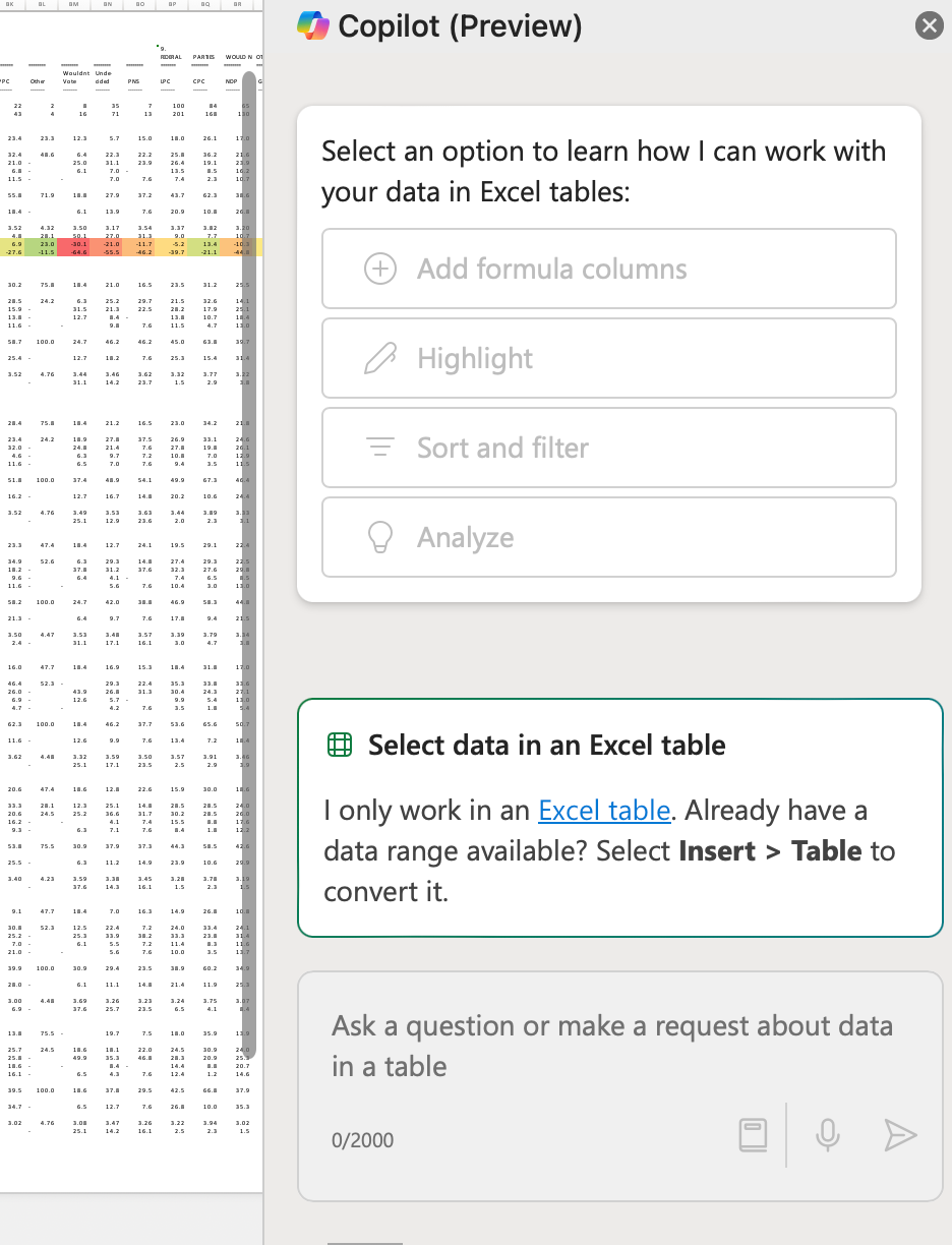
The data looks scary:

This is why you need data scientists on your team! But, if you’re not so lucky, let’s see what we can do with Copilot.
Can Copilot surface fresh insights?
First things first, Copilot can only work if it’s analyzing a table. It can’t start with just the data in a worksheet. You’ll notice when pulling up the chat pane for Copilot that you can’t do anything without your data converted into a table:
I decided to focus on the horse race numbers, selecting the totals, as well as two different age breakdowns. From there, Insert > Table, confirming my data has headers and then was left with this:
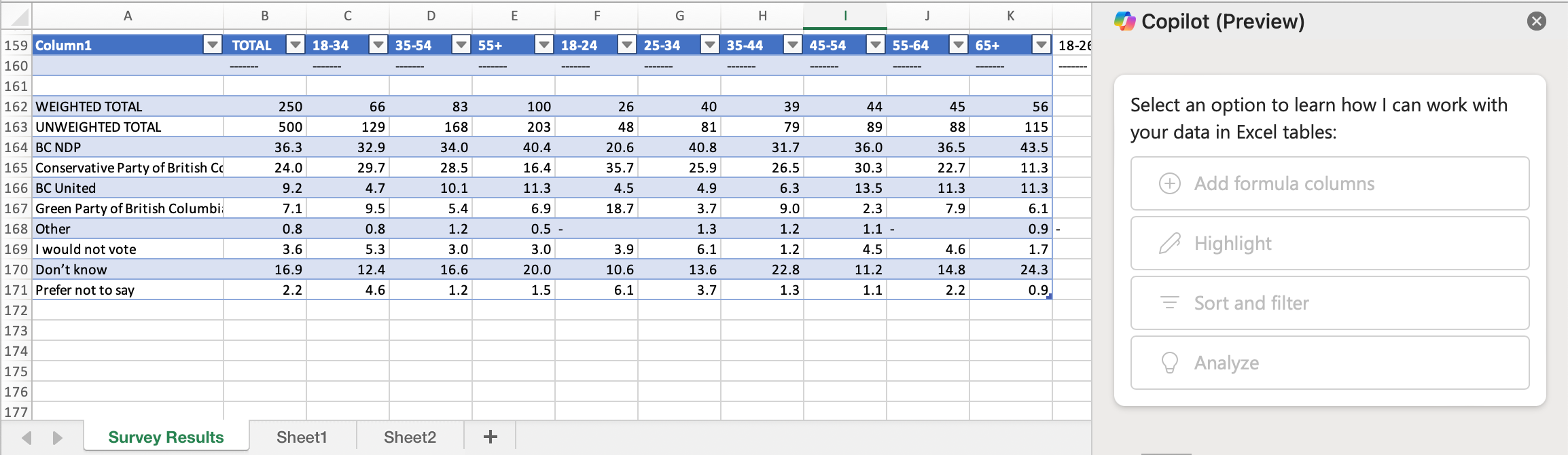
I tested out-of-the-box prompts, curious to see where Copilot would focus its attention:
Show data insights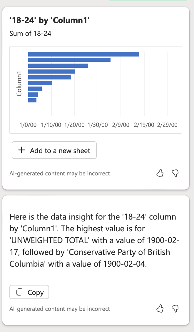
Interesting. Because it’s confusing.
Copilot chose to focus in on the 18-24 demographic because its value for unweighted total is “1900-02-17,” followed by Conservative Party of British Columbia with a value of “1900-02-04.”
Here’s the problem: I don’t recognize either of those values. Here’s what I see:
Unweighted total, 18-24: 48 (respondents)
Conservative Party of British Columbia, 18-24: 35.7 (per cent)
But then something caught my eye:
You’ll notice in the response, Copilot gives me the option to add a new sheet with the data it pulled out. The X-axis appears to follow the date format it seemed to have focused on as a value. I went clicked to add this data to a new sheet. Here’s what I got:
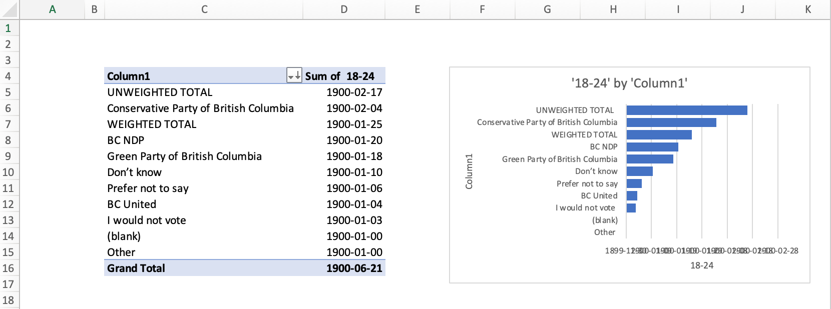
Frankly, useless and unhelpful.
None of the original cells were formatted as dates. Yet Copilot did rank each row correctly, identifying that the Conservative Party of British Columbia has the largest share of support among 18-24 year olds, followed by the BC NDP, the Greens, and BC United.
And what is genuinely interesting is that 18-24 year olds are leaning Conservative, more than any other demographic group in this poll.
So, if I’m looking for silver linings, I suppose those are it. .
For good measure, I asked ask Copilot to explain that value. Here’s what it told me:
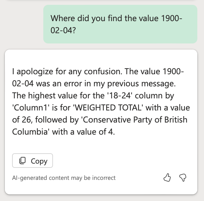
Still wrong. The value for Conservative Party of British Columbia is actually 35.7, not 4.
The complete alteration of the data values, for reasons I could not quickly or easily discern, followed by an admission of error, followed by yet another error, significantly eroded my trust in Copilot’s capabilities for what I consider to be very basic analysis.
Could Copilot perform better if I removed the weighted/unweighted totals from the table? I deleted those two rows to have this is as my new table:

I went back to the drawing board with the same, “show data insights” prompt.
This time, I got this:
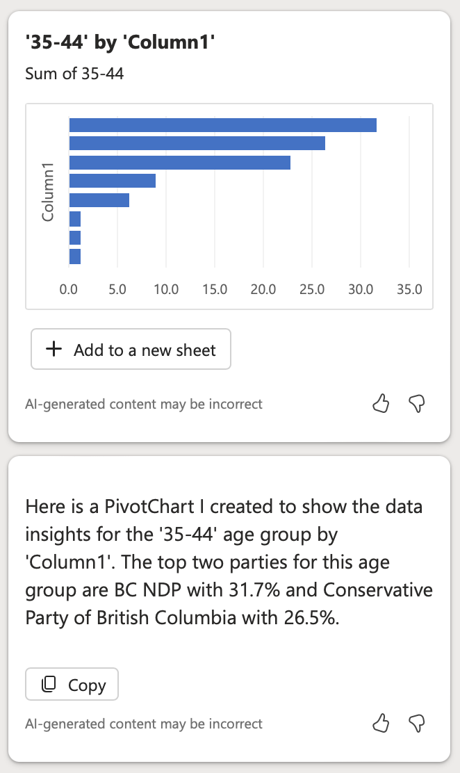
Encouraging. At least we don’t have dates as values where they ought not to exist. Let’s look a little deeper.
Copilot: “The top two parties for this age group are BC NDP with 31.7% and Conservative Party of British Columbia with 26.5%.”
Fact check: Correct.
Let’s look at the pivot chart it created for me. Also correct:
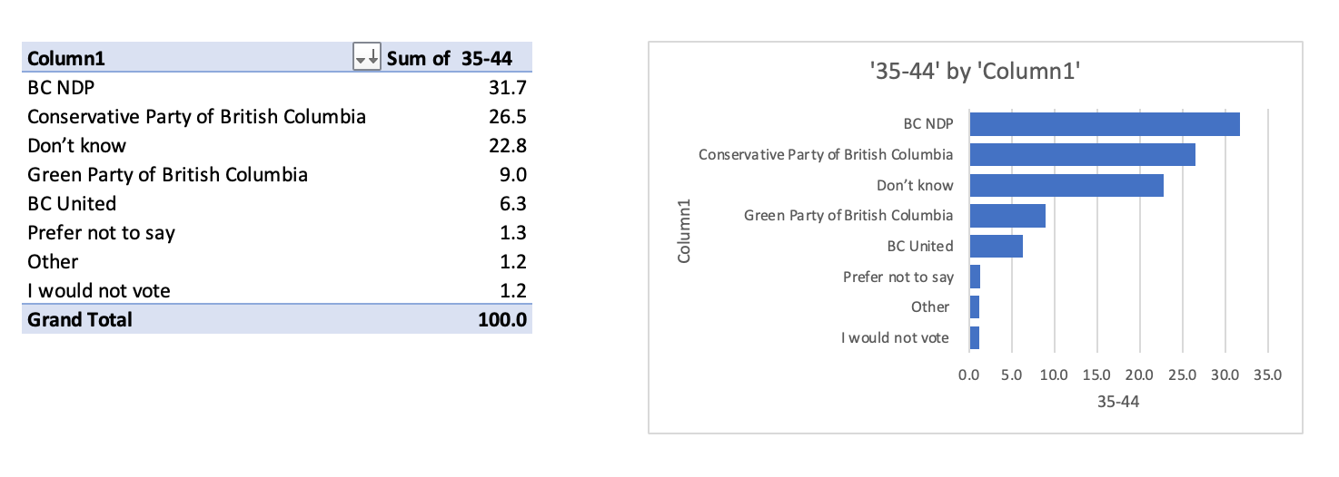
The big lesson:
You need to clean your data before you work with Copilot to analyze it.
I’ve demonstrated my own trial and error process here so you can see just how basic your data table needs to be. Copilot couldn’t make sense of the weighted and unweighted rows in the first table, throwing off the table’s values. I had hoped it would understand the difference between those rows and the others, but it didn’t. So, clean your data, and make it ridiculously easy to consume.
Now that I have a table that Copilot can read well, I moved on to test other prompts Microsoft recommends.
Dig deeper
Which age group (row 159) most supports the BC NDP?The answer I got:
According to the data, the age group that most supports the BC NDP is the '18-34' age group with 32.9%.
This is not correct. Yes, 32.9% of 18-34 year-olds support the NDP, but they are not the group that most supports the BC NDP. The correct answer is the 65+ demographic.
I tried to correct Copilot, but got an error message.
So, I continued, in hope of finding some utility.
Show total support (TOTAL) for each party (column 1)The answer I got:
Here is the total support (TOTAL) for each party (Column1): BC NDP has 36.3%, Conservative Party of British Columbia has 24.0%, Don’t know has 16.9%, BC United has 9.2%, Green Party of British Columbia has 7.1%, I would not vote has 3.6%, Prefer not to say has 2.2%, and Other has 0.8%.
This time, Copilot is correct. It also offered to create a new pivot table and chart with this data, and this too was correct:
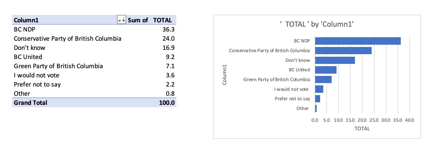
Was this a time saver? If all I wanted to find was the answer to my question, it would have been faster to read the data myself. However, having Copilot produce a chart that answers my question is a time saver.
Let’s try something a little more complex. I wanted to see how over or under-indexed the 18-34 age group is versus the entire data set:
Add a new column showing the percentage difference between column B and column C
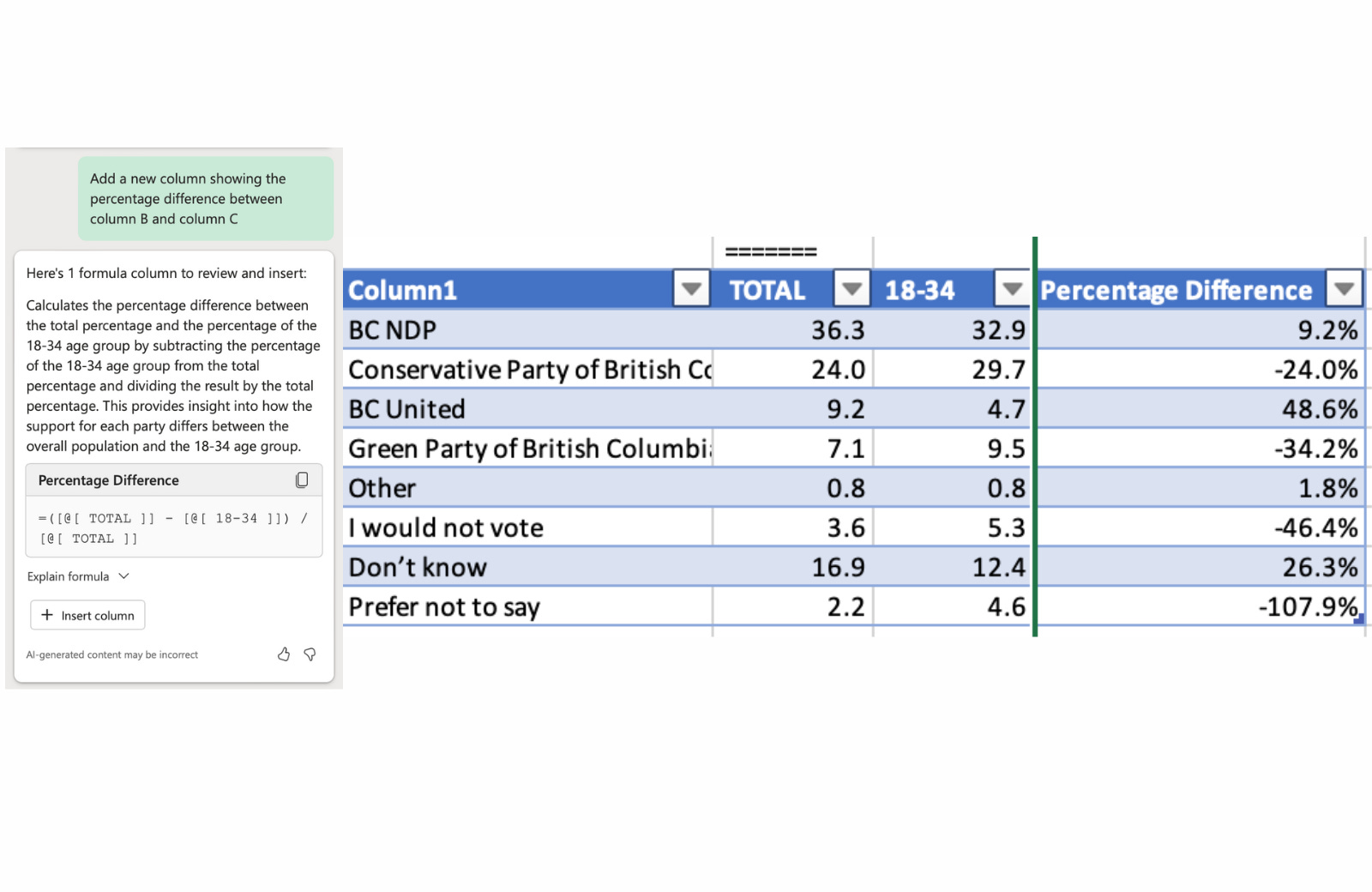
This is not what I was looking for. But that’s my own fault. The devil is in the details. My prompt was not well written. I actually wasn’t looking for a percentage difference. I was looking for a difference. So, with a fresh prompt, here’s what I got:
Add a new column showing the difference between column B and column C
There we go. This is what I wanted:

Another lesson:
Be very precise in your wording. One word can make all the difference.
Formatting your data
One of the other areas Microsoft tells us Copilot can be useful is to highlight, sort, and filter tables to draw attention to what matters to you.
I thought I would draw attention to the fact that the BC NDP enjoys its strongest support with the 55+ crowd.
Highlight the highest values in 55+ (column E)

It worked! But honestly, why wouldn’t I just do this myself? Would have been faster.
Let’s try to sort the data:
Sort 65+ from smallest to largest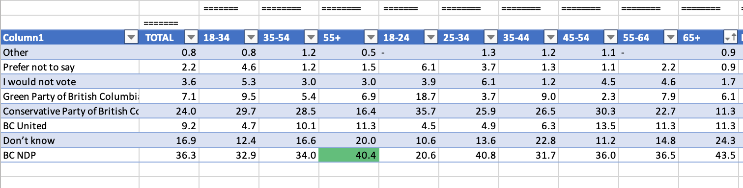
This also worked, but again, it would have been faster to sort it myself.
Takeaways
Overall, I found my experience with Copilot in Excel to be frustrating. I attempted to use it for very basic analysis, and spent more time correcting it, or rewriting my prompts to get what I needed (I spared you 20+ different failed experiments). The effort spent figuring out how to communicate with Copilot was significantly more than the time it would have taken me to do the work myself.
My theory is that if you are an advanced user, you might be able to use Copilot more effectively, but then again, you probably don’t need Copilot if you have ninja Excel skills. AI’s promise is that it’s supposed to make our work more efficient. Copilot can certainly do that in Word and Powerpoint. It has a long way to go in Excel for basic users.
I have no doubt that Microsoft will continue to improve this product, and I’ll continue to experiment with it. I hope to write an update to this newsletter in the near future with an account of how Copilot in Excel is a wonderful thing. For now, you’re better off doing your own analysis.